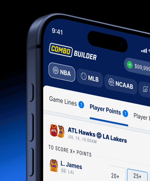
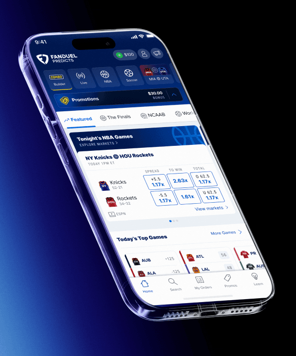
Lobby Redesign
FanDuel Predicts launched as a flat feed of markets — a catalog built before sports became the product. I rebuilt the lobby around one modular merchandising system, so any sport, league, or moment can be surfaced and tested anywhere in the app.
2026
YEAR
Lead Designer
ROLE
AT A GLANCE
Problem
Predicts shipped as an MVP — a single scrolling feed of markets, deliberately category-neutral because we weren't sure sports would even be live at launch. It launched sports-heavy anyway, leaving an app whose structure fought its own content and no real way to merchandise it.
Approach
Starting from the team's workshop synthesis of the lobby's biggest pain points, I designed one modular component system — then used it to rebuild the hierarchy into sport and league pages, a marquee carousel, and daily explore tabs. Phased so a live lobby was never disrupted.
Outcome
Shipped in phases against a World Cup deadline. The flagship Marquee Carousel cut time-to-first- selection by ~20 seconds and drove 63% of add-to-trade-slip actions — and Merch Ops gained a lobby they can tune and A/B test surface by surface.
CONTEXT
Where Predicts started
FanDuel Predicts is a prediction market for sports — people trade on outcomes against each other instead of betting against the house. It launched fast, as an MVP, with the simplest possible lobby: one scrolling feed of markets.
At the time, that made sense. We didn't yet know whether sports markets would be live at launch, so we built the app to be category-neutral — sports was just one category alongside politics, economics, and culture. Then launch went heavily sports. And FanDuel is sports. Overnight, the most important content in the app was the content the lobby was least built to organize.
$44B
TRADED ON PREDICTION MARKETS IN 2025
80%
TRADED ON SPORT MARKETS
$2.5B
PROJECTED TO TRADE ON THE 2026 WORLD CUP
THE PROBLEM
An MVP built for the wrong shape
The MVP's structure was rigid: Category → Subcategory → Market. That works when every category is roughly equal. But sports isn't a category — it's dozens of leagues, hundreds of events, and soon player props for each. Forced into a single "Sports" bucket, it became a long-tailed horizontal scroll of subtabs, with markets buried three taps deep.
The result was an infinite scroll of near-identical cards — Merch Ops couldn't even reorder them or make one stand out.
Discovery took too many taps. Markets sat behind subcategories, which sat behind categories.
Everything looked the same. Homogeneous cards, nothing to break up the page.
Nothing could be merchandised. Order was the only lever; emphasis wasn't possible.
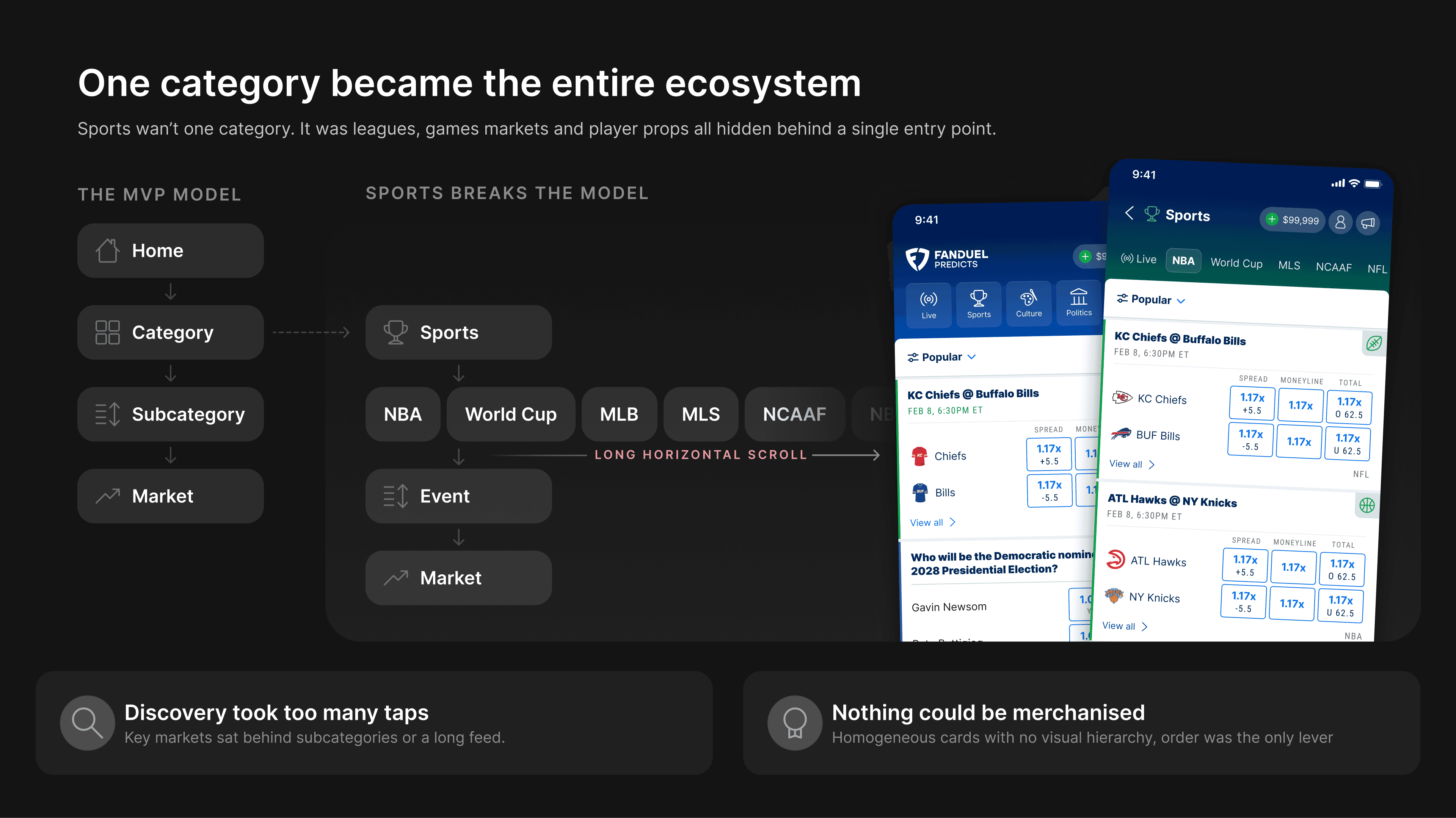
SPORTS CRAMMED INTO ONE CATEGORY — A LONG-TAILED SCROLL OF SUBTABS
DISCOVERY
Where the ideas came from
The direction didn't start on a blank page. Our team ran a workshop to pressure-test the lobby now that the MVP was stable — first with the core product group, then a wider UX crew — mapping what was working against what wasn't, then sketching against it. As the designer who'd been on Predicts the longest, I brought the product context into the room and helped synthesize what came out.
That synthesis is what framed everything after it. The pain points became requirements; the sharper observations became the blue-sky direction.

SYNTHESIZING PAIN POINTS INTO REQUIREMENTS — AND A DIRECTION
THE BIG IDEA
One system, many surfaces
The obvious response to "add sports organization" is to design a sports homepage, then a league page, then a carousel, then tabs — a pile of one-off screens. I went the other way. I designed a single modular component structure — a shared language of cards and market modules — that could be composed into any of those surfaces.
That one decision is what holds the rest of the work together. The same components build the marquee, the horizontal carousels, the explore tabs, and the sport and league pages. And because they're modular, this was really designed in collaboration with Merch Ops: they can arrange the pieces — pin a market, feature an event, spin up a bespoke page — and test what actually works, without a release for every change.
4
BUILDING BLOCKS COMPOSE EVERY SURFACE IN THE LOBBY
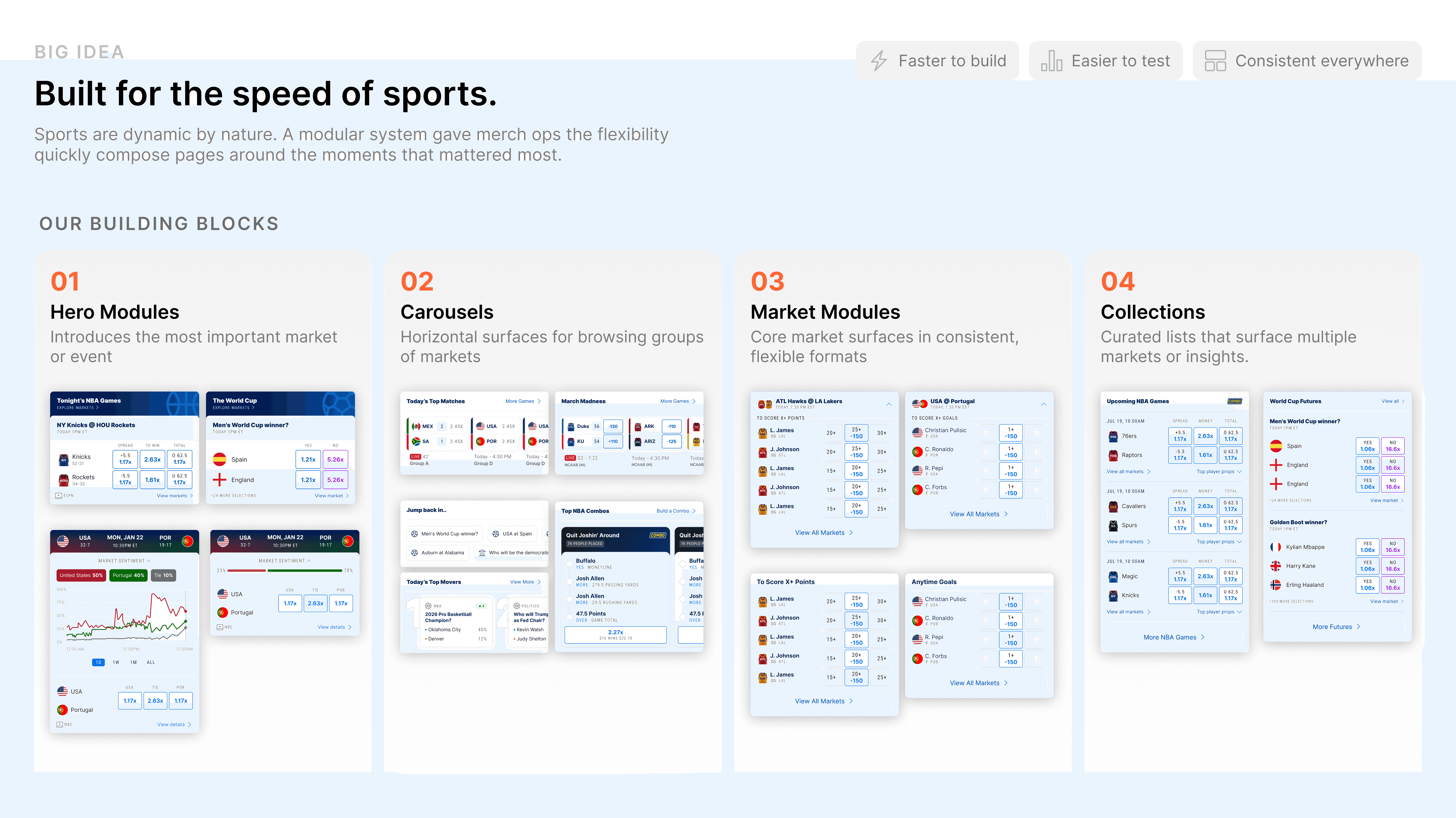
ONE COMPONENT LANGUAGE, COMPOSED INTO EVERY SURFACE
ROLLOUT
Phasing a live rebuild
This was a full navigation and hierarchy revamp on a lobby people were already using — and parts of it had to land by the World Cup. A big-bang release would have disrupted the whole experience, so I sequenced it: ship the pieces that stood on their own first, layer the rest in on an agile cadence, and keep the lobby coherent at every step.

PHASED LEFT TO RIGHT — SO A LIVE LOBBY WAS NEVER DISRUPTED
SOLUTION
Turning the feed into a browse experience
The MVP lobby was an infinite scroll — every market the same weight, nothing to pull you in. I rebuilt it into something you can actually browse: a Marquee up top that spotlights the moment, horizontal market carousels that group markets by theme, and an Explore page with modular daily tabs — each one able to preview a tentpole event, a league, or a single day's games. Big moments and individual athletes get dedicated event and player pages, built from the same modules.
All of it is composed from one component kit, so Merch Ops can rearrange what's featured, spin up a tab, or swap the spotlight without shipping a release.
THE EXPLORE PAGE — A REAL BROWSE EXPERIENCE, BUILT FROM MODULAR TABS

THE SAME KIT COMPOSED INTO A MARQUEE AND THEMED CAROUSELS
STRUCTURE
Rebuilding the hierarchy: sport vs league
Under the visuals sat the hardest problem: what's a sport, what's a league, and how do they nest? The NBA is clean — one league, one page. But soccer runs EPL, La Liga, and Champions League at once; golf, tennis, and motorsport all run many tours concurrently; NCAA football splits into conferences. There's no single rule.
So I built two page types from the same kit, and let each sport's shape decide which one it gets:
WHEN A SPORT IS ONE LEAGUE
The league page is the destination. It opens to a market-type bar — Games, Futures, Combos, Player Props, Bespoke.
Each tab is filtered. Tap "Futures" and you get only futures; tap "Games" and you get only games.
Clean for the Big Four. The NBA, NFL, and the like are one league — one page, no extra layer.
WHEN A SPORT RUNS MANY
A league filter layers on top. Above the market types, users can move between leagues within the sport.
Merch Ops controls the set. Which leagues appear, and in what order, is theirs to arrange.
Built for the messy sports. Soccer (EPL, La Liga, Champions League), golf and tennis tours, NCAA conferences — the cases with no single rule.

IMPACT
What shipped, and what it moved
The redesign went out in phases, with the first delivery landing about a month from kickoff and the World Cup tranche following. The Marquee shipped as an A/B test, and the results were strong across both Standalone and One App.
Shipped a full lobby and hierarchy revamp in phases, without disrupting the live experience.
Gave Merch Ops a lobby they can compose, schedule, region-target, and A/B test surface by surface.
Rolled the modular system across the marquee, carousels, explore tabs, and sport/league pages.
MARQUEE A/B TESTING METRICS
20.1s
FASTER TO FIRST SELECTION (VARIANT VS CONTROL)
+7.1%
SELECTION CONVERSION
63%
OF ADD-TO-TRADE-SLIP ACTIONS STARTED IN THE MARQUEE
REFLECTION
What I took from it
The instinct under deadline pressure is to design screens. The better move was to design a system — one set of components that could become any screen we needed, and that someone else could keep composing after I moved on. That's what let one designer ship something this broad this fast, and it's what makes the lobby something Merch Ops can keep evolving without me.
I also got a lot out of turning a messy MVP inheritance into a direction. The flat feed wasn't a failure — it was the right call for a product that didn't know what it would become. The work was giving it a shape once it did.